Intro
This style guide is intended as a reference for content managers and developers to properly implement the styles, structures and methodlogy employed in the construction of the Camp Bow Wow Corporate & Franchise websites.
Components
These are the basic building blocks of your site
This category contains elements that are structured with standard HTML tags and also base abstractions such as grids, icons, etc.
Modules
These are the more complex structures w/ accompanying functionality built for your site.
This category contains elements composed of groups of components and/or custom structures that function together as a unit.
Coding & Content
For developers and content managers working with the code.
This section of your styleguide contains important information in managing and expanding upon the HTML and CSS of your website.
Palette
Brand
- Blue
- Green
- Red
- Tan
Monochrome
- Grey Lightest
- Grey Lighter
- Grey Light
- Grey
- Grey Dark
- Grey Darker
Messaging - alerts, confirmation, errors etc.
- Red
- Green
- Yellow
Alerts
Boxes which visually alert a user to an error, success or warning can be used on the site by applying the class of "alert" to an element.
Ideally, icon classes should be added to increase visual communication.
Important stuff
<p class="alert">Important stuff<p>Important stuff
<p class="alert alert--blue icon-asterisk">Important stuff<p>Warning!
<p class="alert alert--red icon-attention">Warning!<p>Warning!
<p class="alert alert--yellow icon-attention">Warning!<p>Success!
<p class="alert alert--green icon-check">Success!<p>Self-closing alerts
Just add the class of "alert--closeable" to any alert and it will add the link to remove it from the page once the user has read the message.
Success!
<p class="alert alert--green alert--closeable icon-check">Success!<p>Asides
<aside>
Lorem ipsum dolor...
</aside>Sed ut perspiciatis unde omnis iste natus error sit voluptatem accusantium doloremque laudantium, totam rem aperiam, eaque ipsa quae ab illo inventore veritatis et quasi architecto beatae vitae dicta sunt explicabo. Nemo enim ipsam voluptatem quia voluptas sit aspernatur aut odit aut fugit, sed quia consequuntur magni dolores eos qui ratione voluptatem sequi nesciunt.
<aside class="aside--left">
Lorem ipsum dolor...
</aside>
<p>Sed ut perspiciatis...</p>Sed ut perspiciatis unde omnis iste natus error sit voluptatem accusantium doloremque laudantium, totam rem aperiam, eaque ipsa quae ab illo inventore veritatis et quasi architecto beatae vitae dicta sunt explicabo. Nemo enim ipsam voluptatem quia voluptas sit aspernatur aut odit aut fugit, sed quia consequuntur magni dolores eos qui ratione voluptatem sequi nesciunt.
<aside class="aside--right">
Lorem ipsum dolor...
</aside>
<p>Sed ut perspiciatis...</p>
Badges
Messages 13
<p>Messages <span class="badge">13</span></p>Buttons
There are multiple styles of buttons used on the site with specific uses listed below.
To use, just assign button classes to a text link or input types "button" and "submit".
<a href="" class="btn btn--primary">...</a>
<input name="" type="button" value="input" class="btn btn--primary"><a href="" class="btn btn--secondary">...</a>
<input name="" type="button" value="input" class="btn btn--secondary"><a href="" class="btn btn--tertiary">...</a>
<input name="" type="button" value="input" class="btn btn--tertiary">Used within image bar banners, page banners and against colored backgrounds for transparent effect. Default uses CBW brand blue hue as seen within Corporate and Franchise page banners. Example(s): T1.shtml, T12.shtml
<a href="" class="btn btn--featured">...</a>
<input name="" type="button" value="input" class="btn btn--featured">
There is also class to set the base hue to white for use on other colors. Example(s): T1.shtml
<a href="" class="btn btn--XSm">...</a>
<input name="" type="button" value="input" class="btn btn--XSm"><a href="" class="btn btn--sm">...</a>
<input name="" type="button" value="input" class="btn btn--sm"><a href="" class="btn btn--lg">...</a>
<input name="" type="button" value="input" class="btn btn--lg">
<a href="" class="btn btn--full">...</a>
<input name="" type="button" value="input" class="btn btn--full">Heading 1 Natural
Small text paragraph Natural
<h1>Heading 1 <a href="" class="btn btn--natural">...</a><a href="URL" class="btn btn--fontAccent">...</a><a href="URL" class="btn btn--highlight">...</a><a href="URL" class="btn btn--highlightLight">...</a>Color Bars
Color bars are used to establish full-width color blocks. It can also be used to set backgrounds to content within the main area
Figures - Images
Placement & Use
In-content images should always be placed within the "figure" element for proper placement and responsive sizing. Note that width and height should not be added to images as this may break the responsive layout of the page. The CSS behind your site will manage sizing the images proportionally. Image captions can be added with the "figcaption" element.
Optimization
Images should be saved as JPG, PNG or GIF with settings that compress the image to minimum file size while still maintaining reasonable quality. PNG files should be used when transparency is required, but exercise caution as PNG24 produces rather large file sizes.
Settings will vary according to image, and are at the designer's discretion, but as the site is optimized for mobile, balancing file size with quality is crucial.
Examples

<figure>
<img src="900x200.png">
<figcaption>Caption describing image</figcaption>
</figure>
Lorem ipsum dolor sit amet, consectetur adipisicing elit, sed do eiusmod tempor incididunt ut labore et dolore magna aliqua. Ut enim ad minim veniam, quis nostrud exercitation ullamco laboris nisi ut aliquip ex ea commodo consequat. Duis aute irure dolor in reprehenderit in voluptate velit esse cillum dolore eu fugiat nulla pariatur. Excepteur sint occaecat cupidatat non proident, sunt in culpa qui officia deserunt mollit anim id est laborum.
<figure class="figure--left">
<img src="200x200.png">
<figcaption>Caption describing image</figcaption>
</figure>
<p>Lorem ipsum dolor sit amet...</p>Lorem ipsum dolor sit amet, consectetur adipisicing elit, sed do eiusmod tempor incididunt ut labore et dolore magna aliqua. Ut enim ad minim veniam, quis nostrud exercitation ullamco laboris nisi ut aliquip ex ea commodo consequat. Duis aute irure dolor in reprehenderit in voluptate velit esse cillum dolore eu fugiat nulla pariatur. Excepteur sint occaecat cupidatat non proident, sunt in culpa qui officia deserunt mollit anim id est laborum.
<figure class="figure--right">
<img src="200x200.png">
<figcaption>Caption describing image</figcaption>
</figure>
<p>Lorem ipsum dolor sit amet...</p>
Figures - Videos
Placement & Use
Videos should always be placed within the "figure" element for responsive sizing.
<figure class="figure--video">
<!--embed code for youtube, vimeo, etc-->
<iframe width="420" height="315" src="//www.youtube.com/embed/0Bmhjf0rKe8" frameborder="0" allowfullscreen></iframe>
</figure>Media header
Aximil inulluptibus si officiatur aut accus ad essit as volesci aeprat verior seqvenes comn imp orecat landuciliti.
<div class="mediaBlock">
<figure class="figure--video">
<iframe src="//www.youtube.com/embed/0Bmhjf0rKe8" frameborder="0" allowfullscreen></iframe>
</figure>
<div class="mediaBlock-body">
<h3 class="h4">Media header</h3>
<p>Aximil inulluptibus si...</p>
<p><a class="btn" href="">Learn more</a></p>
</div>
</div>Media header
Aximil inulluptibus si officiatur aut accus ad essit as volesci aeprat verior seqvenes comn imp orecat landuciliti.
<div class="mediaBlock mediaBlock--right">
<figure class="figure--video">
<iframe src="//www.youtube.com/embed/0Bmhjf0rKe8" frameborder="0" allowfullscreen></iframe>
</figure>
<div class="mediaBlock-body">
<h3 class="h4">Media header</h3>
<p>Aximil inulluptibus si...</p>
<p><a class="btn" href="">Learn more</a></p>
</div>
</div>
Grid
For maximum layout flexibility, this site has been built using a responsive, nestable, 24 column grid.
You can adjust column width across various screen widths:
- xsm - Small smartphones
- sm - Larger smartphones and small tablets
- med - Tablets and small desktop monitors
- lg - Large tablets and desktop monitors
- xlg - Desktop monitors and smartTVs
- xxlg - Large desktop monitors and smartTVs
The grid is mobile-first so think of each "column" as naturally being 100% wide and you will be adjusting that width as the screen gets larger.
Basic usage
Place a div on the page with the class of "row". This will hold your columns.
<div class="row"></div>Add your column divs with the class "column" applied to each one.
<div class="row">
<div class="column"></div>
...
<div>
Add classes to the column divs to determine how many of the available 24 columns they will occupy and at what screen size the width should be applied.
<div clas="row">
<div class="column med-12"></div>
...
<div>
When a column width is set, it will also apply to larger screen sizes.
Remember that you are adjusting widths as the screen gets larger. A column with med-12 applied, will take up 12 columns on medium and large screens also. You can add classes to adjust this as demonstrated below.
<div class="row">
<div class="column med-6"></div>
<div class="column med-18"></div>
</div><div class="row">
<div class="column xsm-12 sm-6 med-4 lg-2"></div>
<div class="column xsm-12 sm-6 med-4 lg-2"></div>
<div class="column xsm-12 sm-6 med-4 lg-2"></div>
<div class="column xsm-12 sm-6 med-4 lg-2"></div>
<div class="column xsm-12 sm-6 med-4 lg-2"></div>
<div class="column xsm-12 sm-6 med-4 lg-2"></div>
<div class="column xsm-12 sm-6 med-4 lg-2"></div>
<div class="column xsm-12 sm-6 med-4 lg-2"></div>
<div class="column xsm-12 sm-6 med-4 lg-2"></div>
<div class="column xsm-12 sm-6 med-4 lg-2"></div>
<div class="column xsm-12 sm-6 med-4 lg-2"></div>
<div class="column xsm-12 sm-6 med-4 lg-2"></div>
</div>
</div>Mimicking source order change
Generally, columns will stack top to bottom at their natural 100% width and float left to right once we apply a column width.
<div clas="row">
<div class="column med-12">First in source order</div>
<div class="column med-12">Second in source order</div>
<div>
Once a column width is applied, we can modify this behavior using the following styles (columns still stack top to bottom at 100%):
- push-right-sm
- push-right-med
- push-right-lg
- push-right-xlg
- push-right-xxlg
<div clas="row">
<div class="column med-12 push-right-med">First in source order</div>
<div class="column med-12">Second in source order</div>
<div>
Headings & Paragraphs
Heading 1 - Oswald Uppercase 36px #4c5154
<h1>Heading 1</h1>Heading 2 - Oswald Uppercase 28px #4c5154
<h2>Heading 2</h2>Heading 3 - Oswald 24px #4c5154
<h3>Heading 3</h3>Heading 4 - Oswald 21px #4c5154
<h4>Heading 4</h4>Heading 5 - Oswald 18px #4c5154
<h5>Heading 5</h5>Heading 6 - Oswald 15px #4c5154
<h4>Heading 4</h4>There are several variant classes which can be applied to headers to adjust font, size and color
Heading 1 Light - Oswald #517286
<h1 class="heading--light">Heading Light - #517286</h1>Heading 1 - Pompiere
<h1 class="fontAccent">Heading 1 - Pompiere</h4>Since H1 and H2 default to uppercase, we can make the same heading lowercase, by adding a helper class.
Heading 1 - Pompiere Lowercase
<h1 class="fontAccent heading--lower">Heading 1 - Pompiere Lowercase</h4>Conversely, H3, H4, H5 and H6 are lowercase by default. We can make it uppercase using a similar method
Heading 3 - Uppercase
<h3 class="heading--upper">Heading 3 - Uppercase</h3>Lato 15px #4c5154 - Lorem ipsum dolor sit amet, consectetur adipiscing elit, sed do eiusmod tempor incididunt ut labore et dolore linked text magna aliqua. Ut enim ad minim veniam, quis nostrud exercitation ullamco laboris nisi ut aliquip ex ea commodo consequat.
Duis aute irure dolor in reprehenderit in voluptate velit esse cillum dolore eu fugiat nulla pariatur. Excepteur sint occaecat cupidatat non proident, sunt in culpa qui officia deserunt mollit anim id est laborum.
<p>...</p>Horizontal Rule
<hr /><hr class="rule--dotted" /><hr class="rule--ornament" />Icons
A custom, font-based icon library has been created for your site using fontello.com. Icons can be applied directly to text elements like headings, paragraphs and links or they can also be applied inline pretty much wherever you would like.
You can add icons, edit existing ones or create custom ones at fontello.com. Instructions for using the font library can be found here.
Icons can be applied two different ways:
<a href="javascript:void(0)" class="icon-right-open">Text Link<a><a href="javascript:void(0)">Text Link <i class="icon-right-open"></i></a>Using the <i> method, icons can be styled apart from their containing text element.
Completed
<p><i class="icon-check h-colorGreen"></i> Completed</p>Available icons/classes
Brand Icons
Social Icons
Utility Icons
Islands/Islets
Adds spacing of content with optional color styles
Lorem ipsum dolor sit amet, consectetur adipisicing elit, sed do eiusmod tempor incididunt.
<p class="island">...</p>Lorem ipsum dolor sit amet, consectetur adipisicing elit, sed do eiusmod tempor incididunt.
<p class="island island--greyLighter">...</p>Lorem ipsum dolor sit amet, consectetur adipisicing elit, sed do eiusmod tempor incididunt.
<p class="island island--greyLightest">...</p>Lorem ipsum dolor sit amet, consectetur adipisicing elit, sed do eiusmod tempor incididunt.
<p class="island island--tan">...</p>Be sure you are using helper classes to adjust text color when legibility becomes an issue.
Lorem ipsum dolor sit amet, consectetur adipisicing elit, sed do eiusmod tempor incididunt.
<p class="island island--red h-colorWhite">...</p>Lorem ipsum dolor sit amet, consectetur adipisicing elit, sed do eiusmod tempor incididunt.
<p class="island island--border">...</p>Islets have half the padding an island has
Lorem ipsum dolor sit amet, consectetur adipisicing elit, sed do eiusmod tempor incididunt.
<p class="islet">...</p>Lorem ipsum dolor sit amet, consectetur adipisicing elit, sed do eiusmod tempor incididunt.
<p class="islet islet--grey">...</p>Lorem ipsum dolor sit amet, consectetur adipisicing elit, sed do eiusmod tempor incididunt.
<p class="islet islet--greyLightest">...</p>Lorem ipsum dolor sit amet, consectetur adipisicing elit, sed do eiusmod tempor incididunt.
<p class="islet islet--tan">...</p>Be sure you are using helper classes to adjust text color when legibility becomes an issue.
Lorem ipsum dolor sit amet, consectetur adipisicing elit, sed do eiusmod tempor incididunt.
<p class="islet islet--red h-colorWhite">...</p>Lorem ipsum dolor sit amet, consectetur adipisicing elit, sed do eiusmod tempor incididunt.
Lists
- Item one
- Item two
- Item three
<ul>
<li>Item one<li>
<li>Item two<li>
<li>Item three<li>
</ul>- Item one
- Item two
- Item three
<ul class="list--unstyled">
<li>Item one<li>
<li>Item two<li>
<li>Item three<li>
</ul>- Item one
- Item two
- Item three
<ol>
<li>Item one<li>
<li>Item two<li>
<li>Item three<li>
</ol>- Item one
- Item two
- Item three
<ul class="list--horizontal">
<li>Item one<li>
<li>Item two<li>
<li>Item three<li>
</ul>- Item one
- Item two
- Item three
<ul class="list--horizontal list--separated">
<li>Item one<li>
<li>Item two<li>
<li>Item three<li>
</ul>- Item one
- Item two
- Item three
Requires "list--unstyled" as a base class
<ul class="list--unstyled list--bordered">
<li>Item one<li>
<li>Item two<li>
<li>Item three<li>
</ul>
Loader
<!-- Can be a div or span -->
<div class="loader"></div>Updating...
<p><span class="loader loader--sm"></span>Updating...</p>Matrix
Matrix extends all of the functionality of the 24 column responsive grid with two important exceptions:
- Column count in each .matrix div can exceed 24
- Whereas items of different heights can staircase in the grid, they will not in the matrix
The matrix is very useful for patterns like a page of gallery thumbnails, e-commerce products, etc.
Usage is exactly the same as the 24 column responsive grid except for the use of the matrix class instead of the row class
Some content to make this div taller than the others
A little content
Content
<div class="matrix">
<div class="column xsm-12 sm-6 med-4 lg-2"></div>
<div class="column xsm-12 sm-6 med-4 lg-2"></div>
<div class="column xsm-12 sm-6 med-4 lg-2"></div>
<div class="column xsm-12 sm-6 med-4 lg-2"></div>
<div class="column xsm-12 sm-6 med-4 lg-2"></div>
<div class="column xsm-12 sm-6 med-4 lg-2"></div>
<div class="column xsm-12 sm-6 med-4 lg-2"></div>
<div class="column xsm-12 sm-6 med-4 lg-2"></div>
<div class="column xsm-12 sm-6 med-4 lg-2"></div>
<div class="column xsm-12 sm-6 med-4 lg-2"></div>
<div class="column xsm-12 sm-6 med-4 lg-2"></div>
<div class="column xsm-12 sm-6 med-4 lg-2"></div>
</div>
</div>Quotes
Inline quotes
Sed ut perspiciatis unde omnis iste natus error
sit voluptatem accusantium doloremque laudantium, totam rem aperiam.
<p>Sed ut perspiciatis unde
<q>omnis iste natus error</q>
sit voluptatem accusantium doloremque laudantium, totam rem aperiam.</p>
Blockquotes
There are only two mistakes one can make along the road to truth; not going all the way, and not starting.
Buddha
<blockquote>
<p>There are only two mistakes one can make along the road to truth; not going all the way, and not starting.</p>
<cite>Buddha</cite>
</blockquote>There are only two mistakes one can make along the road to truth; not going all the way, and not starting.
Buddha
Sed ut perspiciatis unde omnis iste natus error sit voluptatem accusantium doloremque laudantium, totam rem aperiam, eaque ipsa quae ab illo inventore veritatis et quasi architecto beatae vitae dicta sunt explicabo. Nemo enim ipsam voluptatem quia voluptas sit aspernatur aut odit aut fugit, sed quia consequuntur magni dolores eos qui ratione voluptatem sequi nesciunt.
<blockquote class="blockquote--left">
<p>There are only two mistakes one can make along the road to truth; not going all the way, and not starting.</p>
<cite>Buddha</cite>
</blockquote>
<p>Sed ut perspiciatis...</p>There are only two mistakes one can make along the road to truth; not going all the way, and not starting.
Buddha
Sed ut perspiciatis unde omnis iste natus error sit voluptatem accusantium doloremque laudantium, totam rem aperiam, eaque ipsa quae ab illo inventore veritatis et quasi architecto beatae vitae dicta sunt explicabo. Nemo enim ipsam voluptatem quia voluptas sit aspernatur aut odit aut fugit, sed quia consequuntur magni dolores eos qui ratione voluptatem sequi nesciunt.
<blockquote class="blockquote--right">
<p>There are only two mistakes one can make along the road to truth; not going all the way, and not starting.</p>
<cite>Buddha</cite>
</blockquote>
<p>Sed ut perspiciatis...</p>
Tables
- Tables should be placed within a div with the class of "tableContainer" applied for responsive sizing and format. By default, tables which are horizontally wider than the viewport on smaller devices will scroll horizontally.
- Classes of "table--striped", "table--bordered" and "table--data" can be added to tables for visual enhancement and usability. It is recommended that you utilize these styles as tables should only be used on the site for tabular data.
- Pixel widths should never be applied to tables as this may break the responsive layout of the page.
| Sample Header | Sample Header 2 | Sample Header 3 |
|---|---|---|
| Row 1, Col 1 | Row 1, Col 2 | Row 1, Col 3 |
| Row 2, Col 1 | Row 2, Col 2 | Row 2, Col 3 |
<div class="tableContainer">
<table class="table">
<thead>
<tr>
<th>Sample Header</th>
<th>Sample Header 2</th>
<th>Sample Header 3</th>
</tr>
</thead>
<tbody>
<tr>
<td>Row 1, Col 1</td>
<td>Row 1, Col 2</td>
<td>Row 1, Col 3</td>
</tr>
<tr>
<td>Row 2, Col 1</td>
<td>Row 2, Col 2</td>
<td>Row 2, Col 3</td>
</tr>
</tbody>
</table>
</div>
Tables are setup to use colspans for adjusting cells widths and spanning across multiple columns. There are also color variations availavle to establish content hierarchy when using multiple table headers in complex tables.
| Full Span Header Across 2 Col in Complex Table, Red | |
|---|---|
| Sample Subheader Light | Sample Subheader Light 2 |
| Row 1, Col 1 | Row 1, Col 2 |
| Row 2, Col 1 | Row 2, Col 2 |
| Row 3, Col 1 | Row 3, Col 2 | Full Span Header Across 2 Col in Complex Table, Darker |
| Sample Subheader Light in Table | Sample Subheader Light in Table 2 |
| Row 4, Col 1 | Row 4, Col 2 |
| Row 5, Col 1 | Row 5, Col 2 |
| Row 6, Col 1 | Row 6, Col 2 |
<div class="tableContainer">
<table class="table">
<thead class="thead--red">
<tr>
<th colspan="2">Full Span Header Across 2 Col in Complex Table, Red</th>
</tr>
</thead>
<thead class="thead--lighter">
<tr>
<th>Sample Subheader Light</th>
<th>Sample Subheader Light</th>
</tr>
</thead>
<tbody>
<tr>
<td>Row 1, Col 1</td>
<td>Row 1, Col 2</td>
<td>Row 1, Col 3</td>
</tr>
<tr>
<td>Row 2, Col 1</td>
<td>Row 2, Col 2</td>
<td>Row 2, Col 3</td>
</tr>
<tr>
<td>Row 3, Col 1</td>
<td>Row 3, Col 2</td>
<td>Row 3, Col 3</td>
</tr>
<thead class="thead--darker">
<tr>
<th colspan="2">Full Span Header Across 2 Col in Complex Table, Darker</th>
</tr>
</thead>
<thead class="thead--lighter">
<tr>
<th>Sample Subheader Light in Table</th>
<th>Sample Subheader Light in Table</th>
</tr>
</thead>
<tbody>
<tr>
<td>Row 4, Col 1</td>
<td>Row 4, Col 2</td>
<td>Row 4, Col 3</td>
</tr>
<tr>
<td>Row 5, Col 1</td>
<td>Row 5, Col 2</td>
<td>Row 5, Col 3</td>
</tr>
<tr>
<td>Row 6, Col 1</td>
<td>Row 6, Col 2</td>
<td>Row 6, Col 3</td>
</tr>
<thead>
<tr>
</tbody>
</table>
</div>
Toggle Links
Show/Hide on Click & Hover
There can be multiple hidden elements and their triggers on one page. The trigger will toggle the hidden div which follows it in the source code.
<a class="toggleLink">Show hidden content 1 on click</a>
<div class="toggleLinkTarget is-hidden">Hidden content 1</div><a class="toggleLink--hover">Show hidden content 1 on click</a>
<div class="toggleLinkTarget is-hidden">Hidden content 1</div>Flyouts
Attention needed
please modify your profile settings
<div class="flyout icon-attention">
<ul class="flyout-content">
<li><a href="...">Link/selection</a></li>
<li><a href="...">Link/selection</a></li>
</ul>
</div>

<div class="flyout icon-attention"> Uh-oh
<div class="flyout-content">
<h4>Attention needed</h4>
<p>please modify your profile <a href="...">settings</a></p>
</div>
</div><div class="flyout icon-attention h-floatRight">
<span class="bug">3</span>
<ul class="flyout-content flyout-content--left">
<li><a href="...">Link/selection</a></li>
<li><a href="...">Link/selection</a></li>
</ul>
</div><div class="flyout flyout--select">Sort: <span>Relevance</span>
<ul class="flyout-content">
<li><a href="javascript:void(0)">Relevance</a></li>
<li><a href="javascript:void(0)">A-Z</a></li>
<li><a href="javascript:void(0)">Modified date</a></li>
</ul>
</div>Forms
Make sure that the "for" attribute of all labels match the "id" of the form elements they are associated with. Most browsers will set focus on an element when you click on it's label and this is also important for screen-readers/accessibility.
Use the proper text field type for the information you are asking for. In responsive, this is especially important as smartphones and tablets will display keyboards optimized for various form field types.
<!--For entering text. First name, last name, etc.-->
<label for="textField">input type="text"</label>
<input type="text" placeholder="Enter text" id="textField">
<!--For entering passwords-->
<label for="passwordField">input type="password"</label>
<input type="password" placeholder="Enter password" id="passwordField">
<!--For entering web addresses-->
<label for="urlField">input type="url"</label>
<input type="text" placeholder="Enter URL" id="urlField">
<!--For entering email addresses-->
<label for="emailField">input type="email"</label>
<input type="email" placeholder="Enter email address" id="emailField">
<!--For entering search terms-->
<label for="searchField">input type="search"</label>
<input type="search" placeholder="Enter search term" id="searchField">
<!--For entering numbers-->
<label for="numberField">input type="number"</label>
<input type="number" placeholder="Enter number" id="numberField">
<!--For entering larger blocks of text-->
<label for="theTextArea">Textarea</label>
<textarea cols="" rows="" placeholder="Enter some longer text" id="theTextArea"></textarea><label for="selectOne">Select an option</label>
<select id="selectOne">
<option>Option 1</option>
<option>Option 2</option>
<option>Option 3</option>
</select><fieldset>
<legend class="legend--labelStyle">Select items</legend>
<div class="formCheckBox">
<span>
<input type="checkbox" id="checkOne">
<label for="checkOne">Option1</label>
</span>
<span>
<input type="checkbox" id="checkTwo">
<label for="checkTwo">Option2</label>
</span>
<span>
<input type="checkbox" id="checkThree" >
<label for="checkThree">Option3</label>
</span>
</div>
</fieldset><fieldset>
<legend class="legend--labelStyle">Select an item</legend>
<div class="formRadioButton">
<span>
<input type="radio" name="radios" id="radioOne">
<label for="radioOne">Option1</label>
</span>
<span>
<input type="radio" name="radios" id="radioTwo">
<label for="radioTwo">Option2</label>
</span>
<span>
<input type="radio" name="radios" id="radioThree">
<label for="radioThree">Option3</label>
</span>
</div>
</fieldset>Image Bar Banner
Image bar banners are similar to page banners, but caculate and size the image to fill the available space of its' container instead of simply swapping images. The calculations are based on the viewport width of the browser and/or device. They can be used on templates as fullbleed or held within the main content column. The default image bar banner copy block aligns right and has an opaque green background.
Please note: to use image bars on a template page, it must be ensured the correct script code is also be injected. This should be handled within iApps.
Example Header Lorem Ipsum
Lorem ipsum dolor sit amet consectetur adipiscing ilicit. Adipic tetur adpisic smod tempor alor.
Learn More<div class="imageBar">
<div class="imageBar-imageContainer" data-stretchsm="URL" data-stretchlg="URL"></div>
<div class="imageBar-colorBlock">
<div class="imageBar-colorBlock-copy">
<h3>Example Header Lorem Ipsum</h3>
<p>Lorem ipsum dolor sit amet consectetur adipiscing ilicit. Adipic tetur adpisic smod tempor alor.</p>
<a href="" class="btn btn--featured btn--featured--lt h-fontHighlightLight">Learn More</a>
</div>
</div>
</div>Each image bar banner requires two image sizes across responsive design.
If the image bar banner is included within the main content (ex: T15) it requires small and medium sized images:
If the image bar banner is fullbleed (ex: T14) , it requires small and large sized images:
The default alignment of the image bar banner copy block can be moved to the left with a helper class. You will need to adjust your image focus accordingly.
Example Header Lorem Ipsum
Lorem ipsum dolor sit amet consectetur adipiscing ilicit. Adipic tetur adpisic smod tempor alor.
Learn More<div class="imageBar">
<div class="imageBar-imageContainer" data-stretchsm="URL" data-stretchlg="URL"></div>
<div class="imageBar-colorBlock imageBar-colorBlock--left">
<div class="imageBar-colorBlock-copy">
<h3>Example Header Lorem Ipsum</h3>
<p>Lorem ipsum dolor sit amet consectetur adipiscing ilicit. Adipic tetur adpisic smod tempor alor.</p>
<a href="" class="btn btn--featured btn--featured--lt h-fontHighlightLight">Learn More</a>
</div>
</div>
</div>Similar to page banners, image bar banners includes several color variations setup within the code. These are controlled by applying helper classes.
- .imageBar-colorBlock--blue
- .imageBar-colorBlock--red
- .imageBar-colorBlock--tan
Example Header Lorem Ipsum
Lorem ipsum dolor sit amet consectetur adipiscing ilicit. Adipic tetur adpisic smod tempor alor.
Learn More<div class="imageBar">
<div class="imageBar-imageContainer" data-stretchsm="URL" data-stretchlg="URL"></div>
<div class="imageBar-colorBlock imageBar-colorBlock--blue">
<div class="imageBar-colorBlock-copy">
<h3>Example Header Lorem Ipsum</h3>
<p>Lorem ipsum dolor sit amet consectetur adipiscing ilicit. Adipic tetur adpisic smod tempor alor.</p>
<a href="" class="btn btn--featured btn--featured--lt h-fontHighlightLight">Learn More</a>
</div>
</div>
</div>Media Block
Place any image and text-like content side-by-side, as per: http://stubbornella.org/content/2010/06/25/the-media-object-saves-hundreds-of-lines-of-code
Basic usage is for images. For usage with videos see video section
Media header
Aximil inulluptibus si officiatur aut accus ad essit as volesci aeprat verior seqvenes comn imp orecat landuciliti.
<div class="mediaBlock">
<figure><img src="200x200.png"></figure>
<div class="mediaBlock-body">
<h3>Media header</h3>
<p>Aximil inulluptibus si officiatur aut accus ad essit as volesci aeprat verior seqvenes comn imp orecat landuciliti.</p>
<p><a href="" class="btn">Learn more</a></p>
</div>
</div>Media header
Aximil inulluptibus si officiatur aut accus ad essit as volesci aeprat verior seqvenes comn imp orecat landuciliti.
<div class="mediaBlock mediaBlock--right">
<figure><img src="200x200.png"></figure>
<div class="mediaBlock-body">
<h3>Media header</h3>
<p>Aximil inulluptibus si officiatur aut accus ad essit as volesci aeprat verior seqvenes comn imp orecat landuciliti.</p>
<p><a href="" class="btn">Learn more</a></p>
</div>
</div>
Pagination
<div class="pagination">
<div class="pageNumbers">
<a class="prev inactive"><a href="#"></a>
<span class="current">1</span>
<a><a href="#">2</a>
<a><a href="#">3</a>
<a><a href="#">4</a>
<a><a href="#">5</a>
<a class="next"><a href="#"></a>
</div>
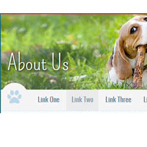
</div>Page Banners
Interior templates have a feature page banner including the current category title. You have several color pattern variations as well as the option for background images. The default page banner includes the blue pattern background.
<div class="bannerMain bannerMain-interior">
<div class="bannerMain-container">
<div class="bannerMain-interior--title"><h1>About Us</h1></div>
</div>
</div>
The pattern includes several color variations setup within the code, controlled by applying helper classes.
- .bannerMain--blueDrk
- .bannerMain--tan
- .bannerMain--tan--HB includes HB logo
- .bannerMain--green includes HB logo
- .bannerMain--red
<div class="bannerMain bannerMain-interior bannerMain--green">
<div class="bannerMain-container">
<div class="bannerMain-interior--title"><h1>About Us</h1></div>
</div>
</div>
You can also set a background image for your page banner. Please select the proper page banner control within iApps to include a background image for mobile, tablet and desktop. This banner requires three image sizes across responsive design.
- 1022px - pagebanner_xlg.psd
- 731px - pagebanner_lg.psd
- 1px - pagebanner_sm.psd

<div class="bannerMain bannerMain-interior">
<div class="bannerMain-container">
<div class="bannerMain-bannerFeature">
<div class="bannerMain-bannerFeatureImg"><picture>
  ...source of three image sizes goes here, as inserted from iApps...</picture>
</div>
</div>
</div>
</div>
Some banners require additional copy beyond merely a page title, such as the Metro Landing page. This banner includes variant divs to include an extended CTA.
<div class="bannerMain bannerMain-generic">
<div class="bannerMain-container">
<div class="bannerMain-bannerFeature">
 <div class="bannerMain-bannerFeatureImg"><picture>
  ...source of three image sizes goes here, as inserted from iApps...</picture>
 </div>
</div>
<div class="bannerMain-CTA">
<div class="row">
<div class="column med-12">
<h1>Banner Title</h1><p>Short intro goes here. Lorem ipsum dolor sit amet consectetur adipisicing elit, sed do eiusmod tempor incididunt ut labore et dolore magna aliqua.</p>
</div>
</div>
</div>
</div>
Popups
In-depth documentation, options and examples for the popup modals used on this site can be found here: http://dimsemenov.com/plugins/magnific-popup/documentation.html
<!--The link. data-mfp-src matches id of popup to open -->
<a data-mfp-src="#test-popup" class="openPopup">Show inline popup</a>
<!--the popup-->
<div id="test-popup" class="popup mfp-hide">
Popup content
</div><!--The link. HREF pointed to the image, popupType="image" -->
<a href="File Library/styleguide-files/200x200.png" class="openPopup" popupType="image">Show image popup</a><!--The link. HREF pointed to the YouTube or Vimeo URL, popupType="iframe" -->
<a href="https://www.youtube.com/watch?v=XQWOKBBJ114" class="openPopup" popupType="iframe">Show image popup</a><!--The link. HREF pointed to Google Maps URL (querystring format only!), popupType="iframe" -->
<a href="https://maps.google.com/maps?q=Gary+Lee's+Motor+Club+and+Grub" class="openPopup" popupType="iframe">Show Google Map popup</a>Siderail Callouts
There are a number of siderail callout variations that can be used to feature different content within the site's right rail on desktop. On mobile and tablet, these callouts collapse below the main content.
The HTML snippets below reflect the interior structure for the siderail content. iApps will wrap each individual callout with an encompassing div which will set it's responsive grid structure relative to it's appropriate template. To understand how your site grid works, please see section: Grid
Generic Siderail Callout
Lorem ipsum dolor sit amet, consectetur adipisicing elit nullam ac maruis quisque. Inline link example.
Example Button<div class="islet islet--tan h-hardEnds">
<div class="ornament icon-paw">
<h5 class="h-pushSmBottom">Generic Siderail Callout</h5>
<p class="h-lineHeightXSm">Lorem ipsum dolor sit amet, consectetur adipisicing elit nullam ac maruis quisque. <a href="URL">Inline link example</a>.</p>
<a class="btn" href="URL">Example Button</a>
</div>
</div>
Template Example(s): T10
This is the most flexible callout. You can include images, buttons, links, text fields, etc. within the content area. Using helper classes outlined within this styleguide, you can change the background color, text color and featured icon to achieve visual variations.
<div class="islet islet--red h-hardEnds">
<div class="ornament ornament--invert icon-heart">
<h5 class="h-colorWhite h-pushSmBottom">Example Variation: Full-Click Siderail Callout, Red with Icon Alt</h5>
<p class="h-colorWhite h-lineHeightXSm">This entire block is a link and clicks through. This can be used to link full blocks of content versus having an inline link or button. Remember to use helper classes to adjust font colors for legibility.</p>
</div>
</div>
Template Example(s): T9
Featured Image Callout with Ornament Rule
Callout for when the image is the main focus. Lorem ipsum dolor sit amet consectetur adipisicing iz erat set do euiu somongn tempor.
<img class="h-pushBottom" src="URL" />
<h4 class="h-pushSmBottom heading--light">Featured Image Callout with Ornament Rule</h4>
<hr class="h-pushSmBottom rule--ornament h-colorHeadingLight">/>
<p class="h-pushSmBottom">Callout for when the image is the main focus. Lorem ipsum dolor sit amet consectetur adipisicing iz erat set do euiu somongn tempor</p>
<p class="h-sizeXXLg">
<a href="URL"><i class="icon-android h-pushSmRight"></i></a>
<a href="URL"><i class="icon-apply"></i></a>
</p>
Template Example(s): T15
Sign Up for Our Newsletter
Lorem ipsum dolor sit amet, consectetur adipisicing elit nullam ac maruis quisque.
<div class="islet islet--tan h-hardEnds">
<div class="ornament icon-email">
<h5 class="h-colorRedBrand h-pushSmBottom">Sign Up for Our Newsletter</h5>
<p class="h-lineHeightXSm">Lorem ipsum dolor sit amet, consectetur adipisicing elit nullam ac maruis quisque.</p>
<div class="insetButtonField h-pushBottom">
<label>Newsletter Sign up</label>
<input type="text" placeholder="Email Address" name="newsletterSignup" id="newsletterSignup"/>
<input type="submit" value="fetch" class="btn btn--tertiary"/>
</div>
</div>
</div>
Sign Up for Our Newsletter
Lorem ipsum dolor sit amet, consectetur adipisicing elit nullam ac maruis quisque.
<div class="islet islet--red h-hardEnds">
<div class="ornament ornament--invert icon-email">
<h5 class="h-colorWhite h-pushSmBottom">Sign Up for Our Newsletter</h5>
<p class="h-colorWhite h-lineHeightXSm">Lorem ipsum dolor sit amet, consectetur adipisicing elit nullam ac maruis quisque.</p>
<div class="insetButtonField h-pushBottom">
<label>Newsletter Sign up</label>
<input type="text" placeholder="Email Address" name="newsletterSignup" id="newsletterSignup"/>
<input type="submit" value="fetch" class="btn btn--tertiary"/>
</div>
</div>
</div>
Template Example(s): T16
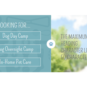
Are You a New Customer?

If you are a new customer and are interested in bringing your dog to Camp, please Request an Interview
<div class="island island--greyLighter island--pullLast">
<h5 class="heading--upper h-textCenter">Are You a New Customer?</h5>
<img class="h-pushSmBottom" src="URL"/>
<p>If you are a new customer and are interested in bringing your dog to Camp, please <a href="URL">Request an Interview</a></p>
<p class="h-textCenter"><a class="btn btn--full btn--lg h-fontHighlightLight" href="URL">Request Interview</a></p>
</div>
Upcoming Events
Event Name Here
Bark & Play Bar & Grill
June 20, 2015
Camp Bow Wow Location
Camp Bow Wow Location
<div class="islet islet--greyLighter islet--pullLast">
<h5 class="heading--upper h-textCenter">Upcoming Events</h5>
<img class="h-pushSmBottom" src="URL"/>
<a class="h-flush h-lineHeightXSm" href="URL">Event Name Here</a>
<p class="h-sizeSm h-underline--dashed h-lineHeightXSm">Bark & Play Bar & Grill</br>
June 20, 2015</p>
<div class="mediaBlock h-underline--dashed h-pushBottom">
<figure class="mediaBlock-figure eventCalendar">
<span class="eventCalendar-month">Aug</span>
<span class="eventCalendar-day">2</span>
</figure>
<div class="mediaBlock-body">
<a class="h-flush h-lineHeightXSm" href="URL">Event Name Here</a>
<p class="h-sizeSm h-lineHeightXSm">Camp Bow Wow Location</p>
</div>
</div>
<p class="h-textCenter"><a class="btn btn--full btn--long h-fontHighlightLight" href="URL">View all events</a></p>
</div>
Template Example(s): T15
Camp Bow Wow Hicksville
1234 Main Street
New York, NY 11234
212.123.4567
- Mon
- 7am - 12pm
- 4am - 7pm
- Tue
- 7am - 7pm
- Wed
- 7am - 7pm
- Thu
- 7am - 7pm
- Fri
- 7am - 7pm
- Sat
- 7am - 7pm
- Sun
- 7am - 7pm
- Holidays
- 4pm - 7pm
<div class="island island--tan h-hardEnds">
<div class="ornamnet icon-location">
<h5 class="h-colorRedBrand h-pushSmBottom">Camp Bow Wow Hicksville</h5>
<p class="h-lineHeightXSm">1234 Main Street</br>
New York, NY 11234</br>
212.123.4567</p>
<dl>
<dt>Mon</dt>
<dd>7am - 12pm</dd>
<dd class="multiLine">4PM - 7PM</dd>
<dd class="newLine"></dd>
<dt>Tues</dt>
<dd>7am - 7pm</dd>
<dd class="newLine"></dd>
<dt>Wed</dt>
<dd>7am - 7pm</dd>
<dd class="newLine"></dd>
<dt>Thurs</dt>
<dd>7am - 7pm</dd>
<dd class="newLine"></dd>
<dt>Fri</dt>
<dd>7am - 7pm</dd>
<dd class="newLine"></dd>
<dt>Sat</dt>
<dd>7am - 7pm</dd>
<dd class="newLine"></dd>
<dt>Sun</dt>
<dd>7am - 7pm</dd>
<dd class="newLine"></dd>
<dt>Holidays</dt>
<dd>4pm - 7pm</dd>
<dd class="newLine"></dd>
</dl>
<p><a class="btn btn--full btn--tertiary" href="URL">New? Schedule Interview</a></p>
<p><a class="btn btn--full btn--tertiary" href="URL">Make Reservation</a></p>
</div>
</div>
<div class="islet islet--red h-hardEnds">
<div class="ornament ornamnet--invert">
<h5 class="h-pushSmBottom h-colorWhite">Our Services</h5>
<ul class="list--unstyled list--bordered list--bordered--red">
<li><a class="h-colorWhite" href="URL">Dog Daycare <i class"icon-right-open h-floatRight"></i></a></li>
<li><a class="h-colorWhite" href="URL">Dog Boarding <i class"icon-right-open h-floatRight"></i></a></li>
<li><a class="h-colorWhite" href="URL">Dog Grooming <i class"icon-right-open h-floatRight"></i></a></li>
<li><a class="h-colorWhite" href="URL">Dog Training <i class"icon-right-open h-floatRight"></i></a></li>
<li><a class="h-colorWhite" href="URL">In-Home Pet Care <i class"icon-right-open h-floatRight"></i></a></li>
<li><a class="h-colorWhite" href="URL">Dog Walking <i class"icon-right-open h-floatRight"></i></a></li>
<li><a class="h-colorWhite" href="URL">Poop Scooping <i class"icon-right-open h-floatRight"></i></a></li>
</ul>
</div>
</div>
Tabs
<ul class="tabs">
<li><a href="javascript:void(0)">Tab one</a>
<div>
<p>Content for tab one.</p>
</div>
</li>
<li><a href="javascript:void(0)">Tab two</a>
<div>
<p>Content for tab two.</p>
</div>
</li>
</ul><ul class="tabs tabs--accordion">
<li><a href="javascript:void(0)">Tab one</a>
<div>
<p>Content for tab one.</p>
</div>
</li>
<li><a href="javascript:void(0)">Tab two</a>
<div>
<p>Content for tab two.</p>
</div>
</li>
<li><a href="javascript:void(0)">Tab three</a>
<div>
<p>Content for tab three.</p>
</div>
</li>
<li><a href="javascript:void(0)">Tab four</a>
<div>
<p>Content for tab four.</p>
</div>
</li>
</ul>Downloads
Site Image Templates (PSD)
CBW - web pattern
This is the template for the default repeating web pattern used within page banners. This template includes blue, red, green and tan pattern variations.
CBW - award/testimonial badge
This template is for creating variations of the award/trophy badge, as seen within the awards & testimonials carousel.
Image Bar Banners
These are the templates for creating responsive images for image bar banners. Each image bar banner requires two image sizes.
Fullbleed banners require small and large templates (example:T14); contained banners require small and medium templates (example:T15).
Interior Page Banner
These are the templates for creating responsive images for interior page banners. Each interior page banner requires three image sizes: small, large & extra-large.
Corporate Homepage Banner
These are the templates for creating responsive images for corporate homepage banners. Each corporate homepage banner requires four image sizes: small, medium, large & extra-large.
Franchise Homepage Banner
These are the templates for creating responsive images for franchise homepage banners. Each franchise homepage banner requires four image sizes: small, medium, large & extra-large.
General Coding Notes
- When adding images to the site, do not include width and height in the HTML for the image. Use the appropriate image template provided and the CSS should scale the image automatically.
- iAPPS and this site are designed for you to have great flexibility in adding content such as copy and images. Adding new structural elements should be done by a front end developer familiar with responsive design best practices or the site layout may break.
- If you decide to add HTML elements such as tables, divs or spans, avoid using pixel based widths and use percentages if you must add widths. The site scales content in percentages as it expands and contracts so pixel widths will break the layout.
- As a general rule, after adding content, resize the browser from small to large widths and if possible, view on different devices to ensure added content does not break the layout of the site and looks attractive.
- Do not use Flash content on the site as many mobile devices do not support it.
Helper Classes
Helper classes are provided to accomodate one-off situations where additional CSS attributes need to be applied to an element for layout or presentation purposes.
Font-color Helper Classes
Colors text the basic red used to style the site
<p class="h-colorRed">..</p>Colors text the basic green used to style the site
<p class="h-colorGreen">..</p>Colors text the basic blue used to style the site
<p class="h-colorBlue">..</p>Colors text the basic yellow used to style the site
<p class="h-colorYellow">..</p>Colors text the basic grey used to style the site
<p class="h-colorGrey">..</p>Colors text the basic light grey used to style the site
<p class="h-colorGreyLight">..</p>Colors text the basic lighter grey used to style the site
<p class="h-colorGreyLighter">..</p>Colors text the basic lightest grey used to style the site
<p class="h-colorGreyLightest">..</p>Colors text white
<p class="h-colorWhite">..</p>Colors text black
<p class="h-colorBlack">..</p>Font Face Helper Classes
Style text elements in the same font-family used for headings and highlight text
<p class="h-fontHighlight">..</p>Style text elements in the same font-family as the main font used on the site.
<p class="h-fontBase">..</p>Font Size Helper Classes
H1 size text.
<p class="h-h1">..</p>H2 size text.
<p class="h-h2">..</p>H3 size text.
<p class="h-h3">..</p>H4 size text.
<p class="h-h4">..</p>H5 size text.
<p class="h-h5">..</p>H6 size text.
<p class="h-h6">..</p>XSm size text.
<p class="h-sizeXSm">..</p>Sm size text.
<p class="h-sizeSm">..</p>Lg size text.
<p class="h-sizeLg">..</p>XLg size text.
<p class="h-sizeXLg">..</p>Alignment Helper Classes
Aligns text left.
<p class="h-textLeft">..</p>Aligns text center.
<p class="h-textCenter">..</p>Aligns text right.
<p class="h-textRight">..</p>Margin Helper Classes
Adds base spacing margin all around.
<p class="h-push">..</p>Adds base spacing margin to top.
<p class="h-pushTop">..</p>Adds base spacing margin to right.
<p class="h-pushRight">..</p>Adds base spacing margin to bottom.
<p class="h-pushBottom">..</p>Adds base spacing margin to left.
<p class="h-pushLeft">..</p>Adds base spacing margin to top and bottom.
<p class="h-pushEnds">..</p>Adds base spacing margin to right and left.
<p class="h-pushSides">..</p>Adds small spacing margin all around.
<p class="h-pushSm">..</p>Adds small spacing margin to top.
<p class="h-pushSmTop">..</p>Adds small spacing margin to right.
<p class="h-pushSmRight">..</p>Adds small spacing margin to bottom.
<p class="h-pushSmBottom">..</p>Adds small spacing margin to left.
<p class="h-pushSmLeft">..</p>Adds small spacing margin to top and bottom.
<p class="h-pushSmEnds">..</p>Adds small spacing margin to right and left.
<p class="h-pushSmSides">..</p>Adds large spacing margin all around.
<p class="h-pushLg">..</p>Adds large spacing margin to top.
<p class="h-pushLgTop">..</p>Adds large spacing margin to right.
<p class="h-pushLgRight">..</p>Adds large spacing margin to bottom.
<p class="h-pushLgBottom">..</p>Adds large spacing margin to left.
<p class="h-pushLgLeft">..</p>Adds large spacing margin to top and bottom.
<p class="h-pushLgEnds">..</p>Adds large spacing margin to right and left.
<p class="h-pushLgSides">..</p>Removes margin all around.
<p class="h-flush">..</p>Removes margin top.
<p class="h-flushTop">..</p>Removes margin right.
<p class="h-flushRight">..</p>Removes margin bottom.
<p class="h-flushBottom">..</p>Removes margin left.
<p class="h-flushLeft">..</p>Padding Helper Classes
Adds base spacing padding all around.
<p class="h-soft">..</p>Adds base spacing padding to top.
<p class="h-softTop">..</p>Adds base spacing padding to right.
<p class="h-softRight">..</p>Adds base spacing padding to bottom.
<p class="h-softBottom">..</p>Adds base spacing padding to left.
<p class="h-softLeft">..</p>Adds base spacing padding to top and bottom.
<p class="h-softEnds">..</p>Adds base spacing padding to right and left.
<p class="h-softSides">..</p>Adds small spacing padding all around.
<p class="h-softSm">..</p>Adds small spacing padding to top.
<p class="h-softSmTop">..</p>Adds small spacing padding to right.
<p class="h-softSmRight">..</p>Adds small spacing padding to bottom.
<p class="h-softSmBottom">..</p>Adds small spacing padding to left.
<p class="h-softSmLeft">..</p>Adds small spacing padding to top and bottom.
<p class="h-softSmEnds">..</p>Adds small spacing padding to right and left.
<p class="h-softSmSides">..</p>Adds large spacing padding all around.
<p class="h-softLg">..</p>Adds large spacing padding to top.
<p class="h-softLgTop">..</p>Adds large spacing padding to right.
<p class="h-softLgRight">..</p>Adds large spacing padding to bottom.
<p class="h-softLgBottom">..</p>Adds large spacing padding to left.
<p class="h-softLgLeft">..</p>Adds large spacing padding to top and bottom.
<p class="h-softLgEnds">..</p>Adds large spacing padding to right and left.
<p class="h-softLgSides">..</p>Removes padding all around.
<p class="h-hard">..</p>Removes padding top.
<p class="h-hardTop">..</p>Removes padding right.
<p class="h-hardRight">..</p>Removes padding bottom.
<p class="h-hardBottom">..</p>Removes padding left.
<p class="h-hardLeft">..</p>Float Helper Classes
Apply to items containing floated elements so the inner elements will not escape the boundaries of their container.
<p class="h-clearfix">..</p>Apply to items to clear both left and right floats.
<p class="h-clearBoth">..</p>Apply to items to clear right floats.
<p class="h-clearRight">..</p>Apply to items to clear left floats.
<p class="h-clearLeft">..</p>Floats items to the right.
<p class="h-floatRight">..</p>Floats items to the left.
<p class="h-floatLeft">..</p>Removes any floats.
<p class="h-floatNone">..</p>Misc Helper Classes
<a class="h-disabled">..</p><a class="h-muted">..</p>Hides an element visually but leaves it accessible to screen readers. Useful for 508 compliance.
<a class="h-visuallyHidden">..</p>Applies bottom border to an element.
<p class="h-underline">..</p>Applies top border to an element.
<p class="h-overline">..</p>Strikes text in the element.
<p class="h-strikethrough">..</p>Displays text in caps.
<p class="h-caps">..</p>Truncates runs of text with a fade (removes line wrapping as well). Lorem ipsum dolor sit amet, consectetur adipiscing elit, sed do eiusmod tempor incididunt ut labore et dolore magna aliqua. Ut enim ad minim veniam, quis nostrud exercitation ullamco laboris nisi ut aliquip ex ea commodo consequat.
<p class="h-truncate">..</p>Naming Convention
This site uses a modified version of the BEM naming syntax. The modified version used is based largely on Nicolas Gallagher's extended BEM syntax. The intention is to make the styles more readable and understandable for humans.
Note though that class names composed of two or more words are written in camelCase as opposed to Gallagher's PascalCase.
/* Component */
.componentName {}

/* Component modifier */
.componentName--modifierName {}

/* Component descendant */
.componentName-descendant {}

/* Component descendant modifier */
.componentName-descendant--modifierName {}

/* Component state (scoped to component) */
.componentName.is-stateOfComponent {}
Begin class names with the most abstract descriptor and then layer in specifics.
/* Basic nav style */
.nav {}

/* The main nav of the site */
.navMain {}

/* The secondary nav of the site */
.navSecondary {}

/* The footer nav */
.navFooter {}
Class names should be reusable and descriptive. We use the multi-class pattern where by laying class names onto an element we can achieve many different and reusable styles.
.button { /* basic button styles */ }
.buttonPrimary { /* styles specific to primary button */ }

<button class="button">Default</button>
<button class="button buttonPrimary">Login</button>
Use .is-stateName to reflect changes to a component's state. The state name must be camel case. Never style these classes directly; they should always be used as an adjoining class.
This means that the same state names can be used in multiple contexts, but every component must define its own styles for the state (as they are scoped to the component).
.tweet { /* ... */ }
.tweet.is-expanded { /* ... */ }

<article class="tweet is-expanded">...</article>
Sass
SASS has been used in the building of this site for ease of maintenance, organization and best practices. The compiled CSS files themselves (base.css, responsive.css and lateIE.css) should not be edited directly or the benefits of using SASS on your site will be lost. Instead, a SASS compatible compiler such as Compass or Scout should be used by a front end developer familiar with SASS and CSS compilers.
If additional non-SASS CSS must be added to the site, it is recommended that additional style sheets be created instead and included in the page.